Don't blame me - I blame
Julie - Okami for it. It was she who suggested I post a pen review or two.
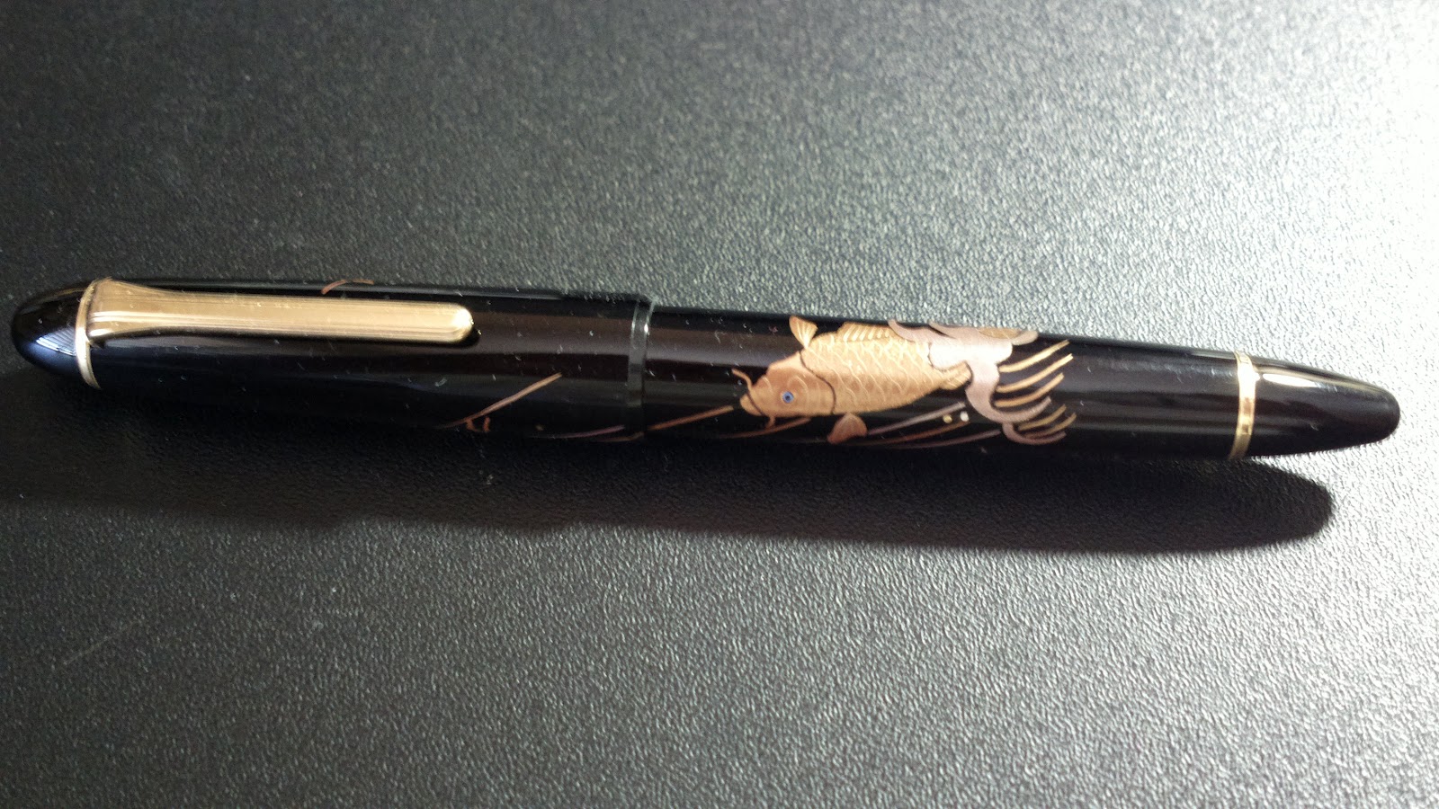
I know Julie suggested my Sailor Koi, but I've always been contrary. I decided to begin with the pen that restarted me on my fountain pen kick (a friend of mine called it a fetish - could be painfully true, but I'm not agreeing).
An Aurora Optima, created for an anniversary. A gift, due to this custom in the United States of the bride and groom giving gifts to the bridal party. And he is my brother, and she my sister-in-law, and I was their best man.
It's a beauty of a pen, causing me to fall in love with Aurora pens, and to remember my love of fountain pens. An 18K gold nib, medium tip, delivers ink very smoothly. Like all Aurora Optimas, the filling system only takes bottled ink, a twist mechanism at the base of the pen fills the reservoir. One neat feature, when it seems the ink has run out, twisting the base of the pen forces a reserve of about one page's worth of ink to the nib.
I've found that useful on more than one occasion.
The ink supplied with it is a very dark blue, and is flowing yet.
I have a second Aurora Optima, again a gift. We had made the mistake of looking at the pen counter in the Halls Department Store in the Country Club Plaza in Kansas City, MO one Christmas. I always look there, but far less frequently buy.
But there it was, this beautiful green Aurora Optima. With the light shining on it, it was impossible to ignore.
It did not hurt that the pen had been marked down quite aggressively. What could one do? Well, I for one could walk away - sighing, I will admit.
But not the one who was with me. The pen was snapped up and presented to me as a gift. And this was after the several-years-standing agreement that we had "enough". Christmas gifts were no longer required nor expected.
Unexpected. And quite beautiful. The 14K gold nib delivers a very smooth line, with absolutely no pressure required. Given the pen body is green, with the most marvelous highlights throughout, it seemed only correct to ink it in green.
So, from Levenger's "Slightly Wild" collection of inks (a collection I can't seem to find any longer), "Always Greener". I shall miss it when it's gone - although the world is full of green inks that I can work my way through.
Still, a collection called "Slightly Wild", how could one resist?
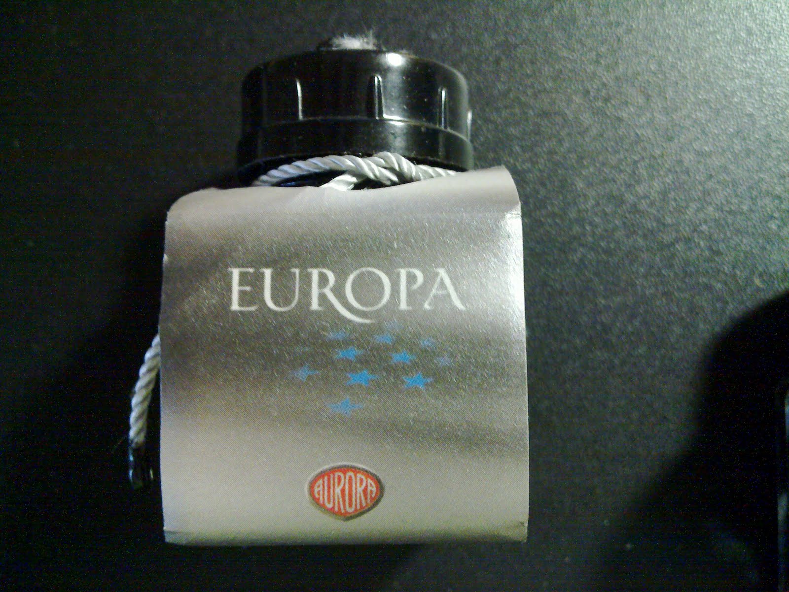
The third of the Auroras was also a gift - this time from myself to myself. One of Aurora's "Continents" limited edition fountain pens. Europa, of course. It could not have been otherwise.
The black and grey (yes, I know, it's the British spelling - but it's a Europa pen. I'll be back to the American spelling tomorrow) is beautifully understated. The cap is slightly translucent, you can see the nib rotate as you screw the cap home.
The nib is an 18K gold nib plated with Rhodium. When it first arrived, the fine nib was a little problematic, not as smooth as I expected.
I sent it to John Mottishaw of
http://www.nibs.com for some work. The result was beautifully smooth and effortless delivery of ink to the page. A joy to write with.
The pen features a steam engine and an image of European industrialization on the silver band at the base of the cap. At the base of the clip there is an engraving of the European continent. The cap is topped with a blue cabochon.
This pen, like the red Optima, arrived with its own ink bottle. Grey, as is only fitting. I have continued to use that, and will till I exhaust the supply.
Then, I'll have to go hunting a grey that will work well with this beautiful pen.
Here are the three pens - the Limited Edition Europa is slightly larger than the other two.
And, finally, an example of how each of them writes. Please do not judge the quality of the pens by the quality of the penmanship. That would do them a disservice.
Enjoy.

 And so the emails went back and forth. I'd thought of the bamboo style, but Ken'd made many of those and I didn't want to ask for yet another. And the curvy design he has is elegant in its simplicity.
 The result is superb in its form and simplicity. The curve fits the hand beautifully.
.jpg)